NuHome Brand Evolution

NuHome Calgary

2025

ROLE

SENIOR UX DESIGNER. OVERSAW END-TO-END UX DESIGN, DIGITAL STRATEGY, AND MARKET ROLLOUT ACROSS WEB AND MOBILE.

IMPACT

ACHEIVED 100K IN SALES WITHIN THE FIRST MONTH. RECORDED A 13% USER CONVERSION RATE, WHICH IS 6.5x HIGHER THAN THE INDUSTRY STANDARD.

A hand holds a smartphone displaying the homepage of NuHome, a Calgary-based roofing company. The screen highlights bold text reading “Reliable Roofing for Your Calgary Home” with a call-to-action button labeled “Start My Project,” and showcases a 4.9/5 rating based on 300 reviews.

INTRODUCTION

Like many home service companies in Calgary, NuHome Calgary (formerly Signature Exteriors) relied heavily on in-person outreach, limiting brand recognition and making lead generation inconsistent. NuHome approached us with a clear challenge:

Move beyond traditional door-to-door sales and build a brand that could scale.

By establishing a unified and memorable brand, NuHome aimed to increase awareness, strengthen trust, and create a more reliable flow of high-quality leads in an industry where strong branding is rare.

Close-up view of a red-tiled rooftop with sharp architectural angles, dramatically lit against a clear deep blue sky. The lighting emphasizes the texture and pattern of the roof tiles, suggesting a focus on roofing quality or design.

INITIAL MARKET RESEARCH

We began with foundational market research to better understand Calgary’s home services landscape and validate NuHome’s early observations. A consistent pattern emerged quickly: many local companies had minimal branding, limited digital presence, and relied heavily on door-to-door sales.

The market felt fragmented, with numerous small, ad-hoc crews competing for the same neighborhoods.

As we dug deeper, we uncovered the underlying reason.

Dramatic photo of a lightning storm at night, with multiple bright bolts striking near a silhouetted treeline. The sky is illuminated in shades of orange, purple, and white, creating a powerful contrast against the dark foreground.

Market Research

Calgary sits in hailstorm alley

Hailstorm alley refers to an area that experiences severe annual hailstorms capable of causing significant exterior damage. Because insurance often covers these repairs, homeowners tend to act quickly and depend on whoever arrives first, creating a fast-moving and reactive market where branding has historically taken a back seat.

This insight shaped our direction. Rather than treating NuHome as another general home service provider, we saw an opportunity to position them as trusted experts in emergency and storm-related exterior repairs. A unified, memorable brand paired with clear service differentiation would give them a strong advantage in a market driven by urgency and trust.

COMPETITIVE ANALYSIS

How might we establish NuHome as a trusted contractor in emergency and storm-related exterior repairs?

With a clearer direction for NuHome’s market position, I conducted a detailed competitor analysis to understand the established players within Calgary’s home services landscape. My goal was to assess how companies communicated their value, differentiated themselves, and showed up across digital channels.

A red and white light rail train blurs through a rainy urban intersection in front of Calgary’s Central Library, known for its striking hexagonal glass façade. Reflections from traffic lights and surrounding buildings shimmer on the wet pavement, adding depth to the moody cityscape.

Competitor Research

A similarly named company was already operating in Calgary

Signature Roof Tile was already operating in Calgary. Although they supply materials rather than provide installation or repair services, the similarity in name posed a real risk. It could create confusion for homeowners, dilute brand recognition, and undermine our strategy to position NuHome as a distinct, trustworthy leader.

Recognizing this, we paused the broader strategic direction and shifted our focus to a full brand revamp. Strengthening and differentiating the brand became our priority to ensure NuHome could enter the market with clarity, confidence, and a truly unique identity.

BRAND REVAMP

With this new direction in place, the brand needed to signal more than a name change—it needed to represent a clear step forward.

The goal was to create a visual identity that communicated structure, strength, reliability, and trust.

The goal was to create a visual identity that communicated structure, strength, reliability, and trust.

The goal was to create a visual identity that communicated structure, strength, reliability, and trust.

I supported the brand refresh by focusing on style application and system clarity. My work centered on selecting and applying typography and colour in a way that reinforced trust under high-stress, time-sensitive conditions, and documenting those decisions in a clear, usable style guide to ensure consistency across all touchpoints.

Typography and color were chosen to reduce visual friction while signaling reliability and urgency. Type styles balanced authority with warmth to support fast scanning as well as longer reading, while the color palette paired energetic tones with stable, grounding ones to communicate responsiveness, strength, and dependability.

Together, these choices helped the brand feel modern and confident while reinforcing trust at every interaction.

Typography brand guide slide showcasing the typeface "Archivo" for headlines, with various weights displayed on the left. The right side explains Archivo's modern, geometric design and advises using it in bold or semibold for visual emphasis, with the phrase “Headlines that stand out.” highlighted in white and orange.
Brand style guide slide featuring four primary colors: Nu Orange, Nu Yellow, Nu Teal, and Nu Teal 60%. The left side explains how the bold palette reflects excellence and trust, with Nu Teal 60% emphasized as the main background color for visual consistency across digital and print.

USER RESEARCH

With a new brand established and ready to compete in Calgary’s home services market, I returned to user research to better understand the people NuHome needed to serve. I focused on uncovering key motivations, needs, pain points, and intent—insights that would directly inform the digital strategy and site structure.

I analyzed local search trends and keyword volume using ahrefs to understand how homeowners in Calgary search for exterior services and what signals urgency versus long-term consideration.

In parallel, I used NuHome as a proxy user and conducted interviews to learn from their direct experience working with past, current, and prospective customers. Together, these inputs helped us identify clear patterns in user intent and decision-making.

From this research, two primary personas emerged.

Iconic view of the Manhattan Bridge framed between two red-brick buildings in the DUMBO neighborhood of Brooklyn, New York. A person stands in the cobblestone street at sunset, with the Empire State Building visible through the bridge’s archway in the distance.

Stakeholder

The Homeowner

The Homeowner is typically looking to upgrade, repair, or improve their existing home through a more considered decision-making process. They demonstrate strong local intent, favoring companies based in Calgary that understand local conditions. Their primary concerns center around craftsmanship, reliability, and fair pricing.

Artistic portrait of a person with a blurred motion effect, lit dramatically in blue and pink neon tones against a soft teal background. The image conveys a sense of movement, introspection, or surreal emotion through its abstract lighting and dynamic blur.

Stakeholder

The Affected Owner

The Affected Owner is responding to sudden damage caused by Calgary’s seasonal hailstorms. Their needs are immediate and emotionally charged, often tied to insurance timelines and the risk of further property damage. While they also show strong local intent, responsiveness and clarity matter far more than price, which is typically covered by insurance.

DIGITAL STRATEGY

With our research findings validated and assumptions confirmed, we shifted focus to defining a digital strategy that would best serve NuHome’s customers and support long-term growth. The goal was to translate strong local intent and a clear need for speed and reliability into a structure that would perform in both search visibility and conversion.

We made the strategic decision to create four separate service-specific websites, each designed to align tightly with user intent.

Abstract image of vibrant city lights in motion blur, with streaks of orange, red, pink, and purple cutting across the frame. The photo evokes a sense of speed and energy, capturing the dynamic atmosphere of a nighttime urban scene.

SEO

Separate sites give us greater control over keyword targeting and search intent

This would improve NuHome’s visibility for homeowners actively searching for roofing, siding, windows and doors, or insulation services in Calgary, positioning the brand to capture more qualified organic traffic.

Portrait of a person with their eyes closed, hand on their face, and a blurred motion effect creating a trailing ghost-like silhouette. The subject is lit with vibrant red and blue lighting against a muted teal background, evoking a moody, introspective atmosphere.

Conversion

This structure enabled stronger message match

Each site could speak directly to the user’s immediate need, reducing cognitive load and making it easier to guide users toward action. By showing users exactly what they were searching for, we removed friction and improved the likelihood of conversion.

WIREFRAMING

I began the design process with low-fidelity wireframes, focusing on two priorities that would position NuHome as a trusted, emergency-ready home service provider.

Three workers install asphalt shingles on a residential roof under a clear sky, with roofing materials and tools spread across the surface. The scene shows part of the roof already completed, emphasizing the active progress of a professional roofing job.

Design Goal

Reinforce NuHome’s role as a reliable emergency provider

To reinforce NuHome’s role as a reliable emergency provider, I researched common design patterns used by emergency-driven services. This included reviewing how other home service companies surface urgency, as well as examining “panic button” and alert-style patterns used in sectors such as healthcare and IT.

Abstract digital art featuring a glowing blue and yellow circular form with horizontal and curved streaks, giving the appearance of motion or distortion. The texture and color gradient evoke a cosmic or futuristic feel, reminiscent of a planet or energy field.

Design Goal

Creating a page structure that builds trust

Alongside urgency, trust was a key driver of the page layout. I approached the structure from the ground up, carefully sequencing content to tell NuHome’s story in a logical and reassuring way. Early sections establish credibility and local roots, followed by clear explanations of services, craftsmanship, and expertise.

Together, these priorities informed a wireframe structure that balanced urgency with reassurance. We landed on a layout that surfaces emergency readiness early through a persistent alert, while guiding users through a clear, trust-building narrative that highlights NuHome’s local expertise, craftsmanship, and reliability.

This foundation ensured users could quickly assess credibility, understand next steps, and convert with confidence—whether responding to an emergency or planning a longer-term project.

Screenshot of the NuHome roofing company website featuring a bird’s-eye view of a house roof, a bold headline reading “Reliable Roofing for Your Calgary Home,” and a contact form on the right. The page highlights emergency services, a 4.9-star rating, and a prominent “Get My Free Quote” button to encourage user inquiries.

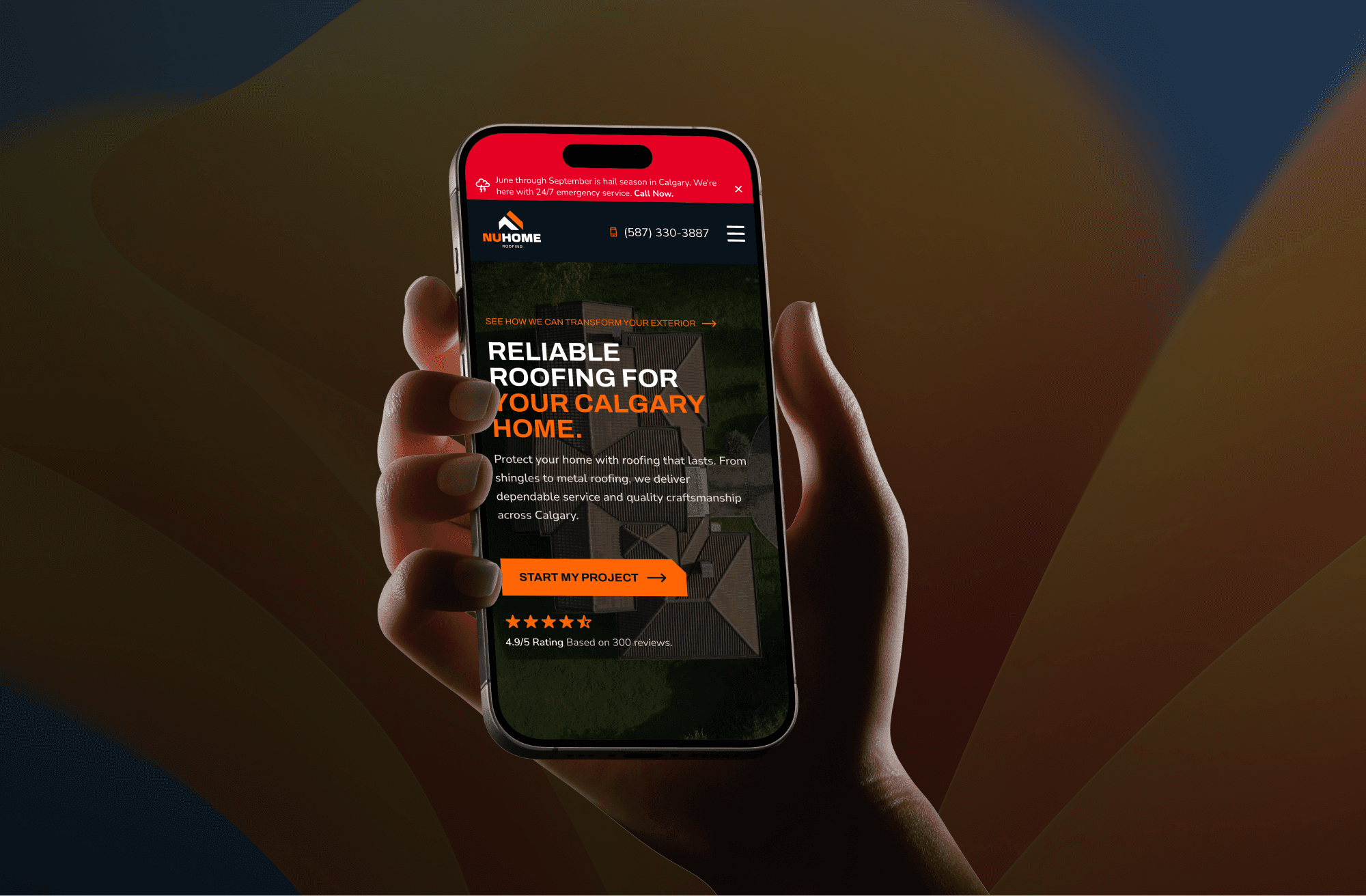
HIGH-FIDELITY DESIGN

With the design goals established during wireframing, I moved into high-fidelity design to bring those decisions to life across each NuHome service vertical.

The focus was on translating urgency, trust, and clarity into a cohesive visual system that felt consistent across sites while still allowing each service to stand on its own.

The focus was on translating urgency, trust, and clarity into a cohesive visual system that felt consistent across sites while still allowing each service to stand on its own.

The focus was on translating urgency, trust, and clarity into a cohesive visual system that felt consistent across sites while still allowing each service to stand on its own.

Two side-by-side website panels from a roofing company highlight their services and values. The left panel, titled "The Clear Path to Protection," outlines the step-by-step roofing process, while the right panel emphasizes “Dependable Roofing for Your Home,” focusing on trust and craftsmanship. Both sections include bright orange call-to-action buttons labeled “Call for a Free Quote.”

CONVERSION-FOCUSED INTERACTION DESIGN

A key priority during this phase was conversion-focused interaction design, particularly on mobile.

Given that many emergency-related searches happen on mobile devices, I carefully analyzed CTA placement and hierarchy to ensure calling NuHome was always fast, visible, and frictionless.

Primary call actions were emphasized through contrast, repetition, and persistent placement to support quick decision-making under pressure.

Testimonial section of a roofing company’s website featuring two client reviews with photos of their homes. One testimonial from Sarah Mitchell praises NuHome for fast, professional hailstorm repairs, while David Chen highlights the ease and quality of a full roof replacement. Both include five-star ratings and emphasize customer satisfaction.

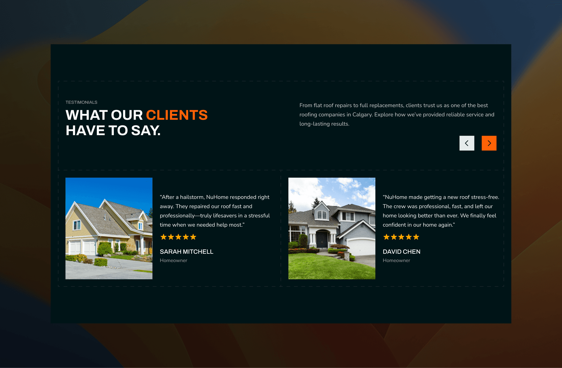
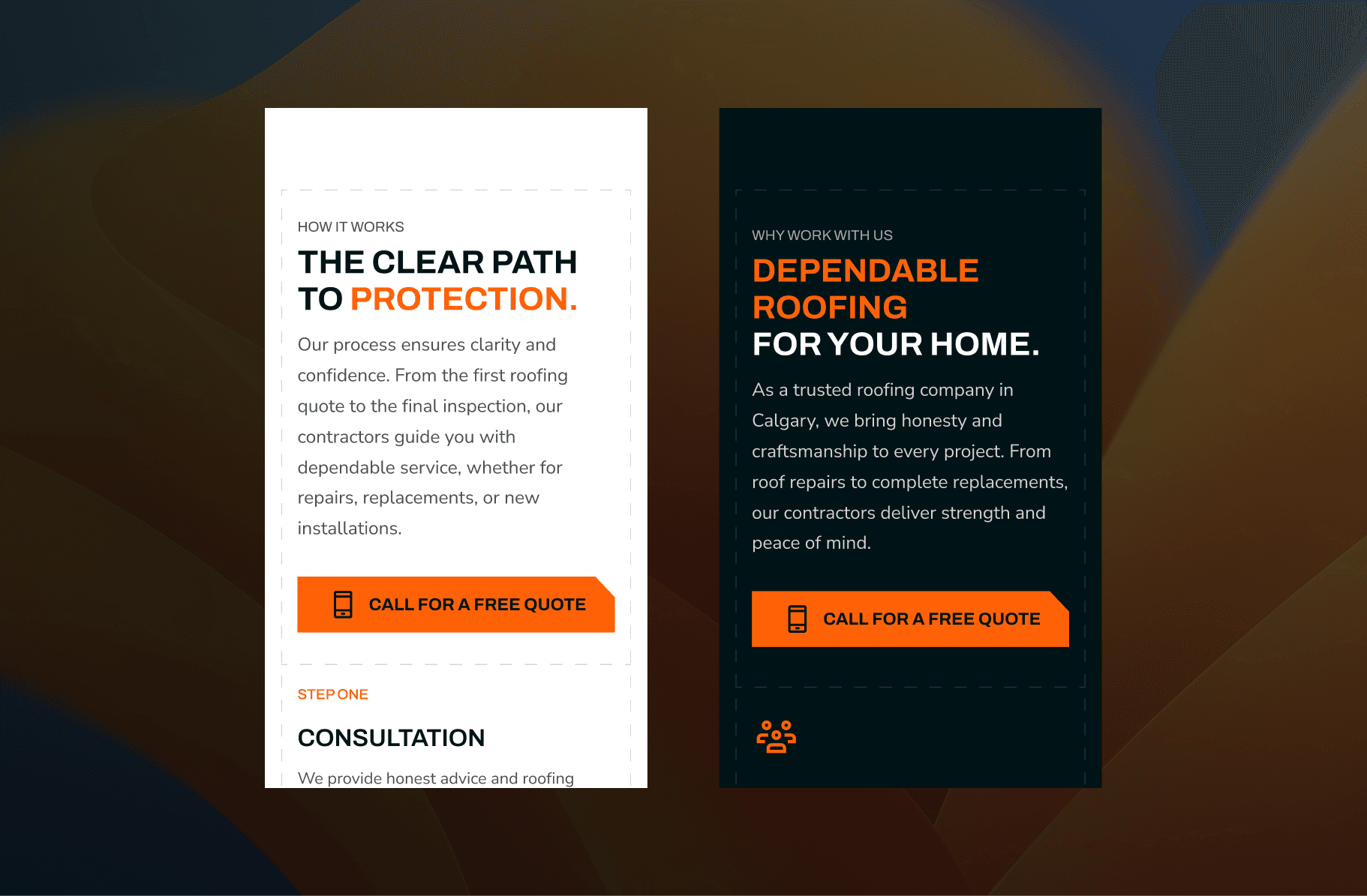
BUILDING CONFIDENCE WITH TRUST SIGNALS

Trust signals were intentionally layered throughout the page experience.

Rather than clustering credibility indicators in a single section, I distributed them progressively as users scroll, reinforcing confidence through service explanations, expertise cues, and local relevance.

This approach ensured trust continued to build alongside the narrative, rather than relying on a single moment of persuasion.

Call to action section for roofing financing options featuring a photo of a modern two-story home with a well-maintained roof. Beside the image, bold text on an orange background encourages Calgary homeowners to “Unlock Flexible Payment Options” with a call-to-action button labeled “See If I Qualify.”

STRATEGICALLY BREAKING THE FLOW

To support conversion without disrupting the experience, CTA sections were strategically placed to break content flow at key decision points.

These moments served as natural pauses, prompting action once enough context and reassurance had been established. Together, these design decisions created a polished, purpose-driven interface that supported both urgency-driven and considered user journeys.

LAUNCH & IMPACT

Following the launch of NuHome’s new digital ecosystem, early performance quickly validated the strategic and design decisions made throughout the project. The combination of clear positioning, strong local intent targeting, and conversion-focused UX resulted in immediate traction.

Sales

Within the first month, NuHome generated $100k in sales

Sales

Within the first month, NuHome generated $100k in sales

Conversion

This was supported by a 13% conversion rate—approximately 6.5× higher than the industry average

Conversion

This was supported by a 13% conversion rate—approximately 6.5× higher than the industry average

Sales

Within the first month, NuHome generated $100k in sales

Sales

Within the first month, NuHome generated $100k in sales

Conversion

This was supported by a 13% conversion rate—approximately 6.5× higher than the industry average

Conversion

This was supported by a 13% conversion rate—approximately 6.5× higher than the industry average

These results demonstrated the effectiveness of pairing a unified brand with service-specific digital experiences that align closely with user intent.

Beyond revenue and conversions, the launch established NuHome as a recognizable and credible presence in Calgary’s home service market. The new brand and website structure created a scalable foundation, positioning NuHome to continue growing awareness, capturing high-intent leads, and expanding across service verticals.

REFLECTION & NEXT STEPS

While the launch outcomes were positive, one area I would have liked to deepen was direct user research. Due to budget constraints, we were not able to conduct user interviews with end-users. NuHome provided extensive insights as a proxy user, which helped guide early decisions and validate assumptions—however, nothing replaces firsthand conversations with homeowners navigating real renovation decisions.

More direct research would have allowed us to further validate pain points, language choices, and decision-making behaviors—especially for high-consideration services.

This reflection has reinforced the importance of balancing budget constraints with stakeholder expertise and end-user input, particularly for service-based businesses where trust and clarity are critical.

A hand holds a smartphone displaying the homepage of NuHome, a Calgary-based roofing company. The screen highlights bold text reading “Reliable Roofing for Your Calgary Home” with a call-to-action button labeled “Start My Project,” and showcases a 4.9/5 rating based on 300 reviews.

📮

Stay connected

From time to time, I share updates about new work and the ideas shaping my design story. If you’d like to stay connected, you’re welcome to subscribe.

Avatar
Avatar

Avatar

Avatar

A small group of thoughtful readers

📮

Stay connected

From time to time, I share updates about new work and the ideas shaping my design story. If you’d like to stay connected, you’re welcome to subscribe.

Avatar
Avatar

Avatar

Avatar

A small group of thoughtful readers

📮

Stay connected

From time to time, I share updates about new work and the ideas shaping my design story. If you’d like to stay connected, you’re welcome to subscribe.

Avatar
Avatar

Avatar

Avatar

A small group of thoughtful readers

" Design is not just what it looks like and feels like. Design is how it works "

— Steve Jobs

UX DESIGNER

" Design is not just what it looks like and feels like. Design is how it works "

— Steve Jobs

UX DESIGNER

" Design is not just what it looks like and feels like. Design is how it works "

— Steve Jobs

UX DESIGNER