NeedLess
NeedLess
2018, 2022
ROLE
UX DESIGNER. OWNED WIREFRAMING, TESTING AND HI-FI DESIGN AS PART OF A TEAM OF UX DESIGNERS.
IMPACT
VALIDATED USABILITY, IDENTIFIED TRUST GAPS, AND INTRODUCED VERIFICATION AND ENGAGEMENT FEATURES TO SUPPORT ADOPTION.

INTRODUCTION
The team at NeedLess approached us with a clear goal: turn an early-stage idea into a tangible digital experience that could support people facing food insecurity.
NeedLess is focused on addressing the homelessness and food access crisis in Brantford, where gaps between surplus food and people in need are both visible and persistent. Their concept centered on a simple but meaningful opportunity:
Helping community members donate leftover food to those who need it most.
At the outset, the team shared preliminary research that helped frame the scope of the problem.

The data highlighted a stark contrast between food waste and food insecurity, as well as the physical barriers people face when accessing support services.
These insights shaped our understanding of the challenge and set the foundation for designing a solution grounded in real community needs.
How might we reduce friction between excess food and people in need to create an immediate, local impact?
USER RESEARCH
To deepen our understanding of the end user, we conducted user interviews to expand on the early insights provided by the NeedLess team.
The goal was to move beyond assumptions and understand how food insecurity shows up locally, day to day.

LOCAL COMMUNITY MEMBERS
We focused our research within the Brantford community, speaking directly with organizations and individuals closest to the problem.
This included interviews with staff and volunteers at local food banks, soup kitchens, and churches, as well as conversations with people experiencing homelessness.

HOMELESS COMMUNITY MEMBERS
Most importantly, we spent time with members of the homeless community themselves—listening to how they navigate food access, technology, and daily decision-making.
These conversations helped us understand not just logistical barriers, but the context in which those barriers exist.
Two insights stood out early and challenged our initial assumptions:


These findings reinforced the importance of designing a mobile-first, low-friction experience—one that meets people where they already are and reflects the realities of their daily lives.
COMPETITIVE ANALYSIS
With a clearer understanding of the end user and the local context in Brantford, we conducted a competitive analysis to establish a baseline for what was already working in the space.
We reviewed existing food-sharing platforms to understand common patterns, feature sets, and engagement models. While several apps addressed food waste directly, an unexpected trend emerged across many of them.

This insight expanded our thinking in two key ways:
It revealed a broader mindset around community sharing, not just food donation.
It introduced a wider potential user base, including people motivated by sustainability and reuse, not solely food insecurity.
Understanding this pattern helped us position NeedLess more intentionally:
Balancing immediate food access needs with a larger ecosystem of community exchange.
IDENTIFYING STAKEHOLDERS
Before jumping to solutions, we developed a set of user personas to represent the end-user.
These personas helped us clearly articulate user needs, motivations, and decision-making patterns by grounding our work in how different users think, behave, and assess risk.


DESIGN GOALS
With our user data clearly laid out and key market opportunities identified, we shifted focus to synthesizing our findings and defining a clear design direction. While existing exchange apps already address many functional user needs, our goal was not to reinvent these patterns.
This led us to a central design goal:
To create a total community exchange app—a single platform where people could exchange anything and everything.
By removing category and use-case limitations, the product aims to reduce waste at a systemic level while making participation simple, flexible, and inclusive for a wide range of community members.
WIREFRAMING & USER JOURNEY
With the design direction solidified, we moved into defining the structural foundation of the app.
I began by mapping the end-to-end user journey, outlining each step from a user’s first interaction with the app through to a successful exchange.
This allowed us to identify key moments of intent, decision-making, and potential drop-off early on, ensuring the experience remained focused and intuitive throughout.

From there, I translated the journey into low-fidelity wireframes. These early explorations helped us visualize core flows, establish information hierarchy, and validate how users would move between key actions
USER TESTING
Before moving into high-fidelity design, we validated our early thinking by testing the user journey and wireframes through 10 in-person think-aloud sessions.
This approach allowed us to observe how participants interpreted the flow in real time and where uncertainty or friction surfaced naturally.


Together, these insights highlighted a critical gap between usability and adoption.
While participants were able to complete tasks successfully, they needed stronger signals of trust to feel confident participating.
At the same time, users questioned what would motivate them to return over time, reinforcing that trust, visible impact, and meaningful feedback would need to be designed as core elements of the experience, not supporting features.
HIGH-FIDELITY DESIGN
With usability validated and key insights identified, I moved into drafting high-fidelity mockups. The goal at this stage was to translate what we learned from testing into a more complete, realistic experience
In parallel, we ran a focused research and brainstorming session to explore how the product could better support these needs. Rather than adding features for complexity’s sake, we prioritized solutions that reduced risk, increased confidence, and gave users a reason to return.
This process led us to three core features designed to resolve the most pressing concerns uncovered during user testing.

VETTING & VERIFICATION SYSTEM
To create a safe environment for giving and receiving, we introduced a vetting and verification system at sign-up.
Users are required to verify their identity using either a verified Facebook account or a photo of a government-issued ID. This step helps establish legitimacy early, setting a clear baseline of trust across the platform.

RATING SYSTEM
To reinforce accountability over time, we designed a two-way rating system that allows users to evaluate each interaction.
Ratings help surface trustworthy participants while identifying users who may violate community guidelines. This mechanism not only improves safety but also gives the platform a way to actively moderate behavior and protect the community.

GAMIFICATION & ENGAGEMENT
Finally, we addressed the question of long-term participation. While requesting help may be straightforward, giving back requires motivation.
To encourage continued contribution, we introduced a weekly leaderboard where users earn points and badges for successful exchanges.
Top contributors are rewarded with small cash incentives and prizes, reinforcing positive behavior while making participation feel meaningful and rewarding.
REFLECTION
Given more time, I would have liked to run an additional round of user testing to validate the trust and engagement features introduced in the high-fidelity designs.
While these solutions were directly informed by earlier research, testing them with real users would have helped confirm whether they effectively addressed concerns around safety, verification, and motivation.
I also would have explored stronger options for anonymous or low-visibility participation. Throughout the project, it became clear that stigma plays a significant role in how people seek food and services. Designing for greater discretion could further reduce barriers to entry and better support users who may need help but hesitate to ask for it openly.
REVISITING NEEDLESS
In 2022, I revisited NeedLess as a personal project with the goal of sharpening my design skills and re-evaluating earlier decisions through a more experienced lens. This gave me the opportunity to build on the original concept without the constraints of project timelines.

ONBOARDING
I expanded the vetting and verification feature into a fully realized onboarding flow, focusing on clarity, reassurance, and transparency.
The updated process better communicates why verification is required and how user information is protected, helping establish trust from the first interaction.

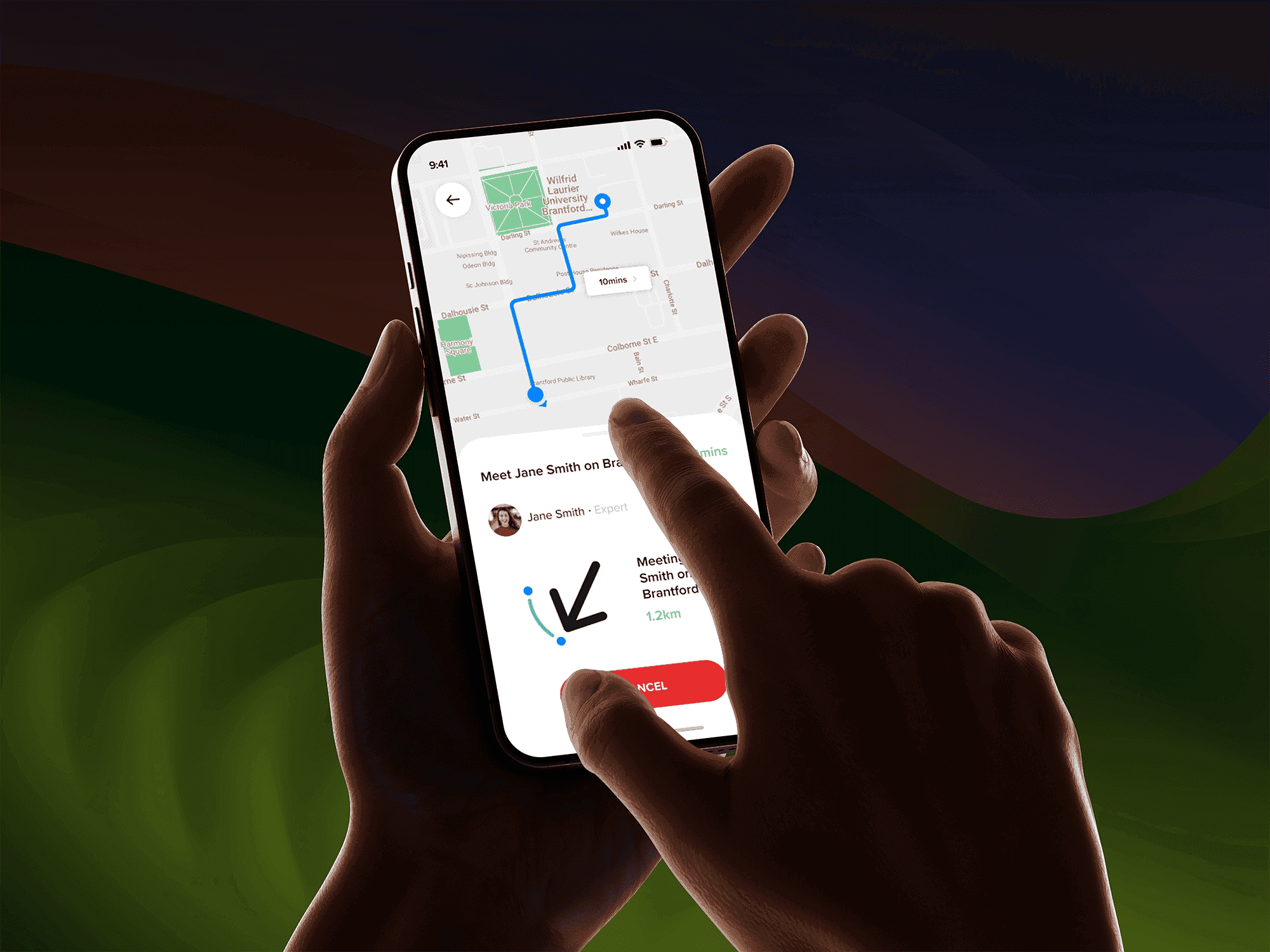
ONBOARDING
To reduce friction during handoffs, I introduced geo-tracking features that allow users to locate one another more quickly and accurately.
This improvement aimed to make exchanges feel safer, more predictable, and easier to complete—especially in time-sensitive situations.
Revisiting the project reinforced how early research insights can continue to inform stronger solutions over time, and how revisiting past work can reveal new opportunities for improvement.